
Long before modern readers became accustomed to hyperlinks, search functions, and digital cross-references, printers developed a remarkably efficient system for guiding attention across the page. A small symbol placed beside a word or sentence could quietly direct the reader elsewhere, connecting one passage to another without disturbing the flow of reading. These symbols, known collectively as reference marks, form one of the oldest navigational systems in the history of the book.
Though many readers encounter them regularly, few stop to consider their origins. Some trace their lineage to the scriptoria of the medieval world, where scribes sought methods of organizing increasingly complex texts. Others emerged from the practical needs of printers during the first centuries of movable type. Together they represent a hidden language of signs and symbols that has endured for hundreds of years.
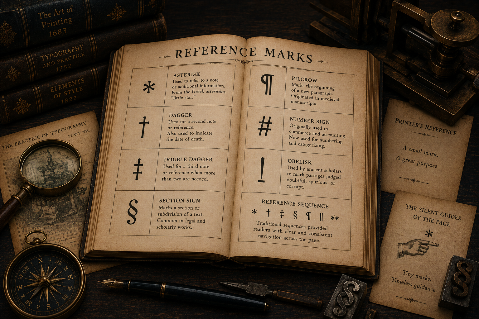
What appears to be a simple mark on a page often carries a rich history of scholarship, printing, and textual organization.
The Asterisk (*)
Among all reference marks, none is more familiar than the asterisk. Its name derives from the Greek word asteriskos, meaning “little star,” an apt description of its appearance. Today it is encountered everywhere—from books and academic articles to legal documents and computer systems—but its origins reach back to the scholars of ancient Alexandria.
Early textual critics employed the asterisk as a tool for identifying passages that required special attention. In printed books, it later became one of the most common markers for notes and references. When a page contained only a single note, the asterisk often served in place of a numerical indicator. Its small size and visual simplicity made it ideal for the task.
The asterisk possesses a unique flexibility. It can signal a footnote, indicate an omission, draw attention to a correction, or highlight an exception to a rule. Because it is instantly recognizable, it remains one of the most versatile symbols in typography.
Its enduring popularity reflects an important principle of book design: the most effective tools are often the simplest.
The Dagger (†)
The dagger, represented by the symbol †, follows the asterisk in traditional sequences of reference marks. Its shape resembles a small cross, a resemblance that has influenced both its practical and symbolic uses throughout history.
Printers adopted the dagger when multiple notes appeared on the same page and a second reference mark became necessary. Once the asterisk had been used, the dagger naturally followed. Readers soon learned to recognize the progression, allowing complex pages to remain orderly without relying exclusively on numbers.
Beyond its role as a reference mark, the dagger acquired additional meanings. In biographical works it often indicates the date of a person’s death. Historical texts frequently employ it for similar purposes, creating an association between the symbol and mortality that persists to this day.
Despite these secondary uses, the dagger’s primary function remains rooted in navigation. It points beyond itself, inviting readers to consult additional information elsewhere on the page.
The Double Dagger (‡)
When a page required still more notes, printers introduced the double dagger. Created by adding a second horizontal bar to the dagger, the symbol ‡ continues the traditional hierarchy of reference marks.
Although less common than either the asterisk or the dagger, the double dagger played an important role in scholarly and legal publishing. In densely annotated texts, it provided a third level of reference without introducing confusion.
The double dagger illustrates the practical ingenuity of early printers. Rather than inventing entirely new symbols, they modified existing forms, creating visual relationships that readers could easily understand. The progression from asterisk to dagger to double dagger established a logical sequence that became familiar throughout the printing world.
Even in modern typography, the double dagger remains a reminder of an era when pages were carefully constructed to balance information, clarity, and visual harmony.
The Section Sign (§)
The section sign, §, occupies a distinctive place among reference marks. Unlike symbols primarily used to direct readers toward notes, the section sign serves as a marker of structure and organization.
Its origins can be traced to medieval manuscript traditions, where scribes developed symbols to identify divisions within legal and religious texts. As printed books became more complex, the section sign proved invaluable for identifying specific portions of a work.
Today it is most commonly associated with legal writing. Statutes, regulations, contracts, and legal commentaries frequently cite sections using this symbol. A reference such as “§ 15” immediately directs readers to a precise location within a larger framework.
The section sign demonstrates how a small typographic symbol can contribute to the architecture of a text. Rather than merely decorating a page, it imposes order upon it, helping readers navigate extensive and often intricate documents.
The Pilcrow (¶)
Few symbols possess a history as rich as the pilcrow. Represented by the mark ¶, it originated as an indicator of paragraph divisions long before modern indentation practices became common.
In early manuscripts, scribes often wrote continuously without the visual cues modern readers take for granted. The pilcrow emerged as a way of marking new sections of thought. Originally added by rubricators in colored ink after the main text had been copied, it provided a visual signal that improved readability.
As printing developed, paragraph indentation gradually replaced many of the pilcrow’s functions. Yet the symbol never entirely disappeared. Editors, proofreaders, and typographers continued to use it, particularly when discussing the structure of documents.
Today the pilcrow survives as both a historical artifact and a practical symbol. It reminds us that the organization of text was once a significant challenge and that even the simplest visual markers contributed to the evolution of reading.
The Number Sign (#)
The number sign, commonly known as the hash, pound sign, or octothorpe, occupies a curious position within typographic history. Modern readers associate it with social media, programming languages, and digital communication, yet its roots extend much further back.
Originally, the symbol developed as a shorthand notation for numbers and quantities. Printers employed it in commercial documents, accounting records, and reference materials. Its compact form allowed information to be presented efficiently, conserving valuable space on the page.
In contemporary usage, the number sign has acquired meanings unimaginable to early printers. Yet despite its technological associations, it remains fundamentally a reference mark. Whether identifying a numbered item, categorizing information, or linking related content, it continues to perform the same essential function: connecting information through symbolic notation.
Its evolution demonstrates how traditional typographic devices can adapt to entirely new forms of communication while preserving their original purpose.
The Obelisk
The term obelisk is one of the oldest names in the vocabulary of reference marks. Derived from the Greek word for a pointed pillar, it originally referred to a symbol resembling a vertical line crossed by a horizontal stroke. In many historical contexts, the obelisk and the dagger referred to the same mark.
Ancient scholars used the obelisk to identify passages considered doubtful, spurious, or corrupt. Rather than directing readers toward additional information, the symbol functioned as a critical judgment, signaling uncertainty about the authenticity of a text.
This practice reveals an important aspect of early scholarship. Readers were not expected to accept every text unquestioningly. Instead, symbols such as the obelisk encouraged critical engagement and careful evaluation.
Although modern editions rarely employ the obelisk in its original sense, its legacy survives in textual criticism and the history of scholarly editing. It stands as a reminder that symbols can do more than organize information—they can express intellectual skepticism and debate.
Reference Sequences
Individual reference marks become most useful when they operate as part of a system. Printers therefore developed ordered sequences that allowed multiple notes to coexist on the same page without confusion.
A traditional sequence often began with the asterisk, followed by the dagger and double dagger. Additional symbols might include the section sign, pilcrow, parallel marks, or repeated versions of earlier symbols. Only after exhausting these options would some printers turn to alternative systems.
The exact sequence varied according to region, period, and publishing tradition, but the principle remained constant: every note required a unique identifier that readers could easily locate.
These sequences reveal the remarkable attention to detail that characterized traditional typography. Every mark had a purpose, every symbol occupied a defined position, and every element contributed to the reader’s experience. What might appear at first glance to be a collection of arbitrary signs was in fact a carefully constructed navigational framework.
The Silent Guides of the Page
Reference marks are among the smallest features found in books, yet they perform some of the most important tasks. They direct attention, organize information, connect ideas, and support scholarship. Most readers barely notice them, which is perhaps the highest compliment such symbols can receive. Their success lies in their ability to function without drawing attention to themselves.
Together, these marks form an invisible infrastructure beneath the text. They are the quiet guides of the printed page, leading readers through layers of meaning, commentary, and interpretation. Though small in size, they occupy a significant place in the history of reading, reminding us that even the tiniest marks can shape the way knowledge is presented and understood.
Member discussion